
Sample UX Interview Challenge
Often the in-person interview process itself is mostly about determining if you can work with this person day-in-day-out. To assess how they apply their skills though, you need something a little bit more interactive.
This morning I read a blog post by London digital recruitment agency Zebra People that couldn't have had better timing! As they stated, "the majority of final stage interviews now require UX Designers to carry out a task at home and present to the interview panel." I recently hired a Jr UX designer and did the same. Questions like, "What process do you follow?" don't cut it because you end up getting the same answers over and over again. Often the in-person interview process itself is mostly about determining if you can work with this person day-in-day-out. To assess how they apply their skills though, you need something a little bit more interactive...
I'm a major stickler for "no free work" as a freelancer so I would never ask someone to break my own rule. Instead of asking them to solve a real problem or redesign something on my own products, I came up with a fake product for a fake client that they needed to design from scratch. Here's the brief:
Following your UX process, please design a product that meets the following business requirements:
The client needs a mobile application.
Users must be able to log in with their email address and password.
When inside the application, users must be able to perform only one task - tapping a button that says "Tap Me"
Users must be able to view historical data on how many times they have tapped this button in the past.
Your deliverable may be in the form of sketches, wireframes, mockups, prototype, technical specifications - whatever documentation you feel represents your personal skill level. There is no minimum or maximum that you must provide.
Please use a maximum of 90 minutes for this challenge.
I gave this assignment to the three people who passed the initial interview rounds. Here's what the responses that I received told me about them:
Did they include all the necessary account management pieces (such as Create Account, Reset Password, etc.) that come with email login?
Did they create a true onboarding flow?
Did they account for differences in user behaviour between iOS, Android and other platforms?
Did they offer any documentation(such as object tables, database schema suggestions, etc) which could be passed straight on to developers?
Did they make a single assumption about how historical data should be viewed, or did they instead create a system that scaled?
How much did they focus on UX strategy vs UI design?
Did they address the challenges caused by knowing nothing about this client or their purpose for the app?
Did they make any alternative suggestions and back them up with justification?
In the end, the designer I hired passed with flying colours and has been a huge asset to our office. We were able to bring her onto the team with confidence that she would be able to dive in the deep end with us.
Check out Zebra People's post for other samples of UX interview challenges.
Got another suggestion? Catch me on Twitter @ashleymarinep.

A Look at Visualisation
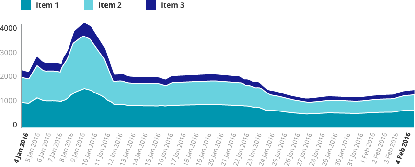
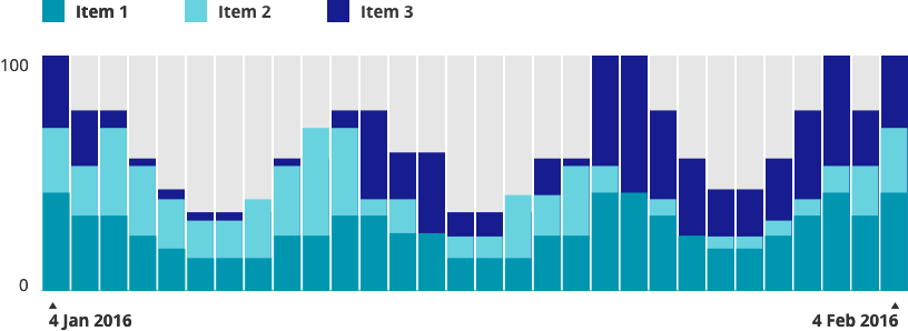
Data visualisation, graphs and charts can be a big challenge in a project. Sometimes it's overwhelming to even know what insights to display, let along how to display it. Here are some tips and tricks I've picked up along the way.
Data visualisation, graphs and charts can be a big challenge in a project. Sometimes it's overwhelming to even know what insights to display, let along how to display it. Below are some tips and tricks I've picked up along the way.
Planning
While planning charts, I start with questions like:
Who is looking at this data?
What is most important to them when viewing this data?
What do they already know or assume from the data?
What pieces of the data do they not care about?
Investigating why anyone wants to see this data is the key to finding that perfect spot of "Informative" which lies somewhere between confusingly vague and confusingly complicated.
I begin the wireframe stage with the most important ifo largest and closer to the top, down to to the least important info smallest and at the bottom.
Then I start looking at each piece of insight and asking why I'm showing that particular piece to the user. There are usually only two reasons to show data to a user:
Explore: Show them a large dataset and allow them to draw their own conclusions.
Explain: Show them a single conclusion within just enough context of a larger data set.
Special thanks to Data Visualization Best Practices for this great tip.
Labels
When it comes to axis labels, it's important to consider how much the user already knows and assumes. Detailed is great...

...but, in situations where you have a particularly tech-savvy user or the audience already knows/assumes certain things about the data, you might be able to go for a cleaner look.

Note that in the first sample, even though a large number of axis labels are shown, interior labels are a lighter font both in weight and colour. Charting axis labels only exist to anchor the viewer. They shouldn't compete for attention.
In some cases, it may even be appropriate to remove them all together and display the values in a different context:

The same principles apply even when flipping the data on it's side:

Short on space? Axis labels can be condensed within bar charts, for example in smaller highlight areas:
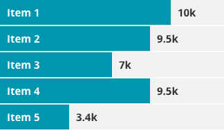
Special thanks to Effective Dashboard Design: Why Your Baby is Ugly for this data set.
Numbers
As in most things, keep it simple.
Bad Numbers

Good Numbers

Again, if you don't need it, junk it!
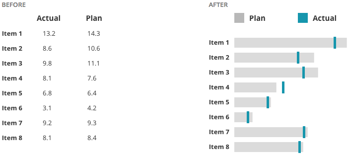
Instead of creating long tables or lists of data, bullet graphs can be a helpful visualisation.
The Line Chart Danger Zone
Having worked quite a bit in design around Health, I can tell you: It's probably best to apply a healthy dose of suspicion around line and area charts. The problem is that they often show stages in between two data points which didn't really exist. When in doubt, I default to bar charts because they don't lie. I'll show you what I mean...
Data points across a bar chart are safe. We can see the days that have available data and what the exact input value was on that day.

Now, place these data points on a line chart. As you can see from the red line, we've started to hint at results that aren't real.

Add a Dribbble-worthy layer of smoothing and shading and now we've created even more of a "curve" which didn't really happen.

Of course, how careful you need to be depends on what you're displaying and how high the stakes are. If you can afford to sacrifice a little pin-point accuracy for beauty, then go for it.
Interaction
I'm a big fan of interactive charts where a user can hover over specific data points and view tooltips (do we still call them that?). When designing this, the data line and point should be clearly isolated, like so:
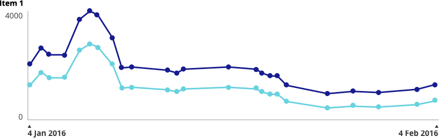
Lines and shading can be used to show alert lines, benchmarks, averages, etc.


I recently had a client who needed to be able to add values to a scatter plot which were un-verified. We came up with this solution of solid vs outlined values:

Similar to hovering over tooltips, I try to make legends interactive when possible. Legend and data are isolated clearly together.

Colour
What good would an article about charting be without some talk about colour?
So, here's the deal: We all know the basics. Green is good, orange & yellow need attention in some way and red is something scary.

Developing a colour palette is a topic that needs its own blog post, but as long as you keep basic colour associations in mind, you're going to be just fine.
When it comes to anything that could be referred to as "colour coding"...
https://twitter.com/ashleymarinep/status/705049544233525249
Do you need to colour code? The answer is "No" more often than not. (I once had a client ask me to colour code all of the individual features in his app. I had to do a set of mockups to show him why looking like a rainbow sneezed across your entire app is a user experience no-no).
One thing that is really important is to make sure that you take into account is accessibility for Colour Blindness. Personally, I use the Spectrum Chrome extension to test out colour combinations.

Below are some simple examples of how colour can be used in charts.
"Feeling" the Weight of Your Data
The final thing I want to talk about is the concept of helping users "feel" their way through the data. Check out The World's Most Boring Data Set. In this use case, high numbers were bad and low numbers are good.

Snooze-fest... but see what happens when we turn those numbers into graphics that use size, weight, colour and opacity:


The eye is automatically drawn to the "good" spots and a user can instantly feel whether this data set is positive or negative.
Fin.
That's all I've got for you today! Have a suggestion, idea, or view to share? Catch me on Twitter @ashleymarinep.

When Individual App Features Become a Larger-Than-Life Monster: Auditing a Franken-Brand
I recently started a project with a client who was managing a successful suite of web & mobile applications, all under the umbrella of their digital brand guidelines. This was a small team and resources were tight, so managing that many apps over multiple swimlanes was threatening to create a monster soon - a monster I refer to as the Franken-Brand.
I recently started a project with a client who was managing a successful suite of web & mobile applications, all under the umbrella of their digital brand guidelines. This was a small team and resources were tight, so managing that many apps over multiple swimlanes was threatening to create a monster soon - a monster I refer to as the Franken-Brand.
What's a Franken-Brand?
Franken-brands happen when apps are built next to apps, and no high-level overview of the brand as a whole has happened in an extended amount of time. This can happen for many reasons. Most commonly because guidelines are implemented faster than they're audited, because we don't know what we don't know when we initially write them. Another reason this can happen is that resourcing is so limited that only one or two people are overseeing an entire suite of applications, so their expertise is only applied on the surface. App-specific requirements are applied on top of general guidelines, and never make it into the official document. This "if it ain't broke, don't fix it" environment is classic in a small team.
What is a Franken-App?
Similarly, Franken-apps happen when features are built on top of features, but high-level overview of the full user experience is neglected. This usually happens when there are multiple stakeholders spread across an application and dedicated product pros are spread too thin. Sometimes, depending on the workflow, initial feature specifications are written side-by-side instead of consecutively, so inconsistencies are naturally created. We work in a field where there are a lot more combinations of "right" answers than "wrong" answers, so two teams may come to entirely reasonable translations of a guideline, but they don't match.
What's to be done about it?
Well, in the case of my client, we're going to form an angry mob - kinda. This week, I launched a full audit of all states of all screens of all apps, after which the entire suite will be reviewed by myself and some other contracted UX pros. Bringing in new talents that I've not worked with before exposes us to other areas of expertise, and ensures that we remove bias from the redesign process. Commonalities between features will be identified and brought into harmony as we develop short-term and long-term specs for change.
After that, the ecosystem-wide guidelines will be updated, and the new version will be used going forward until the day when, inevitably, it's time to review again.
Have a tip on how to avoid the Franken-Brand syndrome? Tweet me @ashleymarinep!

Free Resource Download: Digital Brand & UX Guideline Document
This easy-to-custom template includes pre-formatted sections for a full Digital Brand & UX guideline document.
This easy-to-custom template includes pre-formatted sections for a full Digital Brand & UX guideline document. Sections include:
Primary Logo
Logo Presentation
Brand Colors
Web Fonts
Icons
Dashboard Grid
Navigation
Buttons
Forms
Favicon
Photography
Charts
Social Guidelines
If you found this free resource useful, please follow on Twitter.

guideline-632x3239

When Cheap SFX Hurts People: Designing Experiences for People with Photosensitive Epilepsy
I'm a huge lover of Google Cardboard, virtual reality technology, and other immersive experiences. Sadly, I have to carefully research before I can partake in these, because I have photosensitive epilepsy.
Fair warning, this is really only half blog post and half personal rant. See, I'm a huge lover of Google Cardboard, virtual reality technology, and other immersive experiences. Sadly, I have to carefully research before I can partake in these, because I have photosensitive epilepsy. It rarely effects my life, until I enter a nightclub where I have to dance near the door (just in case), or have to cover my eyes quickly in a cinema. I'm far from the only one suffering from this condition. According to CureEpilepsy.org, 65 million people worldwide currently live with epilepsy, and each year over 200,000 people are diagnosed. About 5% of these have Photosensitive Epilepsy. Some users may not even know, if they've been fortunate enough to have never experienced a seizure. For example, in 1997 a Japanese cartoon aired a scene that included flashing colors, sending nearly 700 children into seizures, some of which had to be hospitalised for weeks.
We all like a good special effect, but the cheap trick of strobes and flashing lights are not worth it. As creatives, we need to be better than that. Even W3.org's Web Content Accessibility Guidelines has a section dedicated to avoiding patterns that are known to cause seizures.
So, how can you make sure your content is safe for us photosensitive folk? Here are some pointers:
Be sure that any flashing occurs at less than 3x per second. Most people with photosensitive epilepsy are sensitive to 16-25 Hz, but can be sensitive to rates as low as 3 Hz. Remember that what is safe and what makes a user comfortable are two different things. Anyone who has experience an epileptic seizure knows how scary and dangerous it can be. A user can’t be expected to measure the frequency of a “technically safe” flashing element. If they know they are sensitive to flashing, they’re more likely to just leave your content entirely if they feel any risk.
When possible, provide a way to “opt out” of flashing content. I've yet to experience any strobes or flashing content that was necessary to the experience, but at least a few times a year I have to leave rooms and turn off screens because of it. If you feel it is absolutely necessary to your project, allow users to opt out quickly, and in a way that makes them feel safe.
Reduce the contrast of necessary flashing content. Again, if flashing content is an absolute must, reduce the contrast. Stark lights/darks are much more likely to trigger a seizure than medium-level greys. Avoiding deeply saturated reds especially.

Hi, I’m Ashley. I’m a creator, entrepreneur, gamer, storyteller, and serial doer.