
Dashboard Design Mini-Lessons
Dashboard design is unique in it's challenges. Huge amounts of data need to be connected and displayed in a way that feels meaningful and intuitive to the user. Even the best data set in the world couldn't withstand the horror that is a useless presentation layer. Here are some key mini-lessons to review before launching any data visualisation feature within a webapp.
Dashboard design is unique in it's challenges. Huge amounts of data need to be connected and displayed in a way that feels meaningful and intuitive to the user. Even the best data set in the world couldn't withstand the horror that is a useless presentation layer. Below are some key mini-lessons to review before launching any data visualisation feature within a webapp:
Be Meaningful
Ask "why" before you spit information back at a user. Charts and numbers do not necessarily equal insight. Every piece of information should be there for a reason, not just because you collected it.
Be Organised
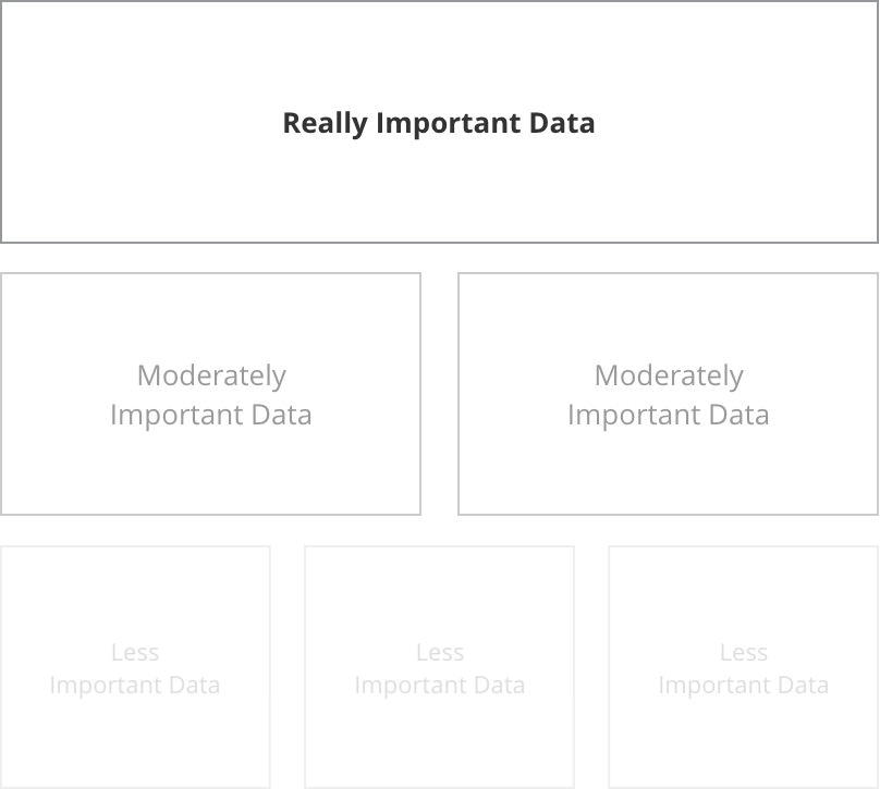
Provide an overview screen or summary, with the option to drill-down into deeper insights. Not only does this help the user mentally process the data, but it supplies you with key analytics regarding your user's behaviours and interests.
For conversion flows, less clicks is always more, but this is often not so when when a user is logged in and engaged with a functional app. More page levels of hierarchy can often be better than scrolling endlessly through charts and displays.
Be Interesting
Use colours purposefully. Light to dark, bright vs muted, blues vs yellows - every colour should fit into an overall structure of visual cues.
Be pragmatic
There is no end to the supply of stunning dashboard mockups for inspiration, but charting is often expensive in development time. Choose wisely, focus on being informative, then add some unique elements where time and budget allow.

A Look at Visualisation
Data visualisation, graphs and charts can be a big challenge in a project. Sometimes it's overwhelming to even know what insights to display, let along how to display it. Here are some tips and tricks I've picked up along the way.
Data visualisation, graphs and charts can be a big challenge in a project. Sometimes it's overwhelming to even know what insights to display, let along how to display it. Below are some tips and tricks I've picked up along the way.
Planning
While planning charts, I start with questions like:
Who is looking at this data?
What is most important to them when viewing this data?
What do they already know or assume from the data?
What pieces of the data do they not care about?
Investigating why anyone wants to see this data is the key to finding that perfect spot of "Informative" which lies somewhere between confusingly vague and confusingly complicated.
I begin the wireframe stage with the most important ifo largest and closer to the top, down to to the least important info smallest and at the bottom.
Then I start looking at each piece of insight and asking why I'm showing that particular piece to the user. There are usually only two reasons to show data to a user:
Explore: Show them a large dataset and allow them to draw their own conclusions.
Explain: Show them a single conclusion within just enough context of a larger data set.
Special thanks to Data Visualization Best Practices for this great tip.
Labels
When it comes to axis labels, it's important to consider how much the user already knows and assumes. Detailed is great...

...but, in situations where you have a particularly tech-savvy user or the audience already knows/assumes certain things about the data, you might be able to go for a cleaner look.

Note that in the first sample, even though a large number of axis labels are shown, interior labels are a lighter font both in weight and colour. Charting axis labels only exist to anchor the viewer. They shouldn't compete for attention.
In some cases, it may even be appropriate to remove them all together and display the values in a different context:

The same principles apply even when flipping the data on it's side:

Short on space? Axis labels can be condensed within bar charts, for example in smaller highlight areas:
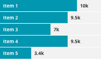
Special thanks to Effective Dashboard Design: Why Your Baby is Ugly for this data set.
Numbers
As in most things, keep it simple.
Bad Numbers

Good Numbers

Again, if you don't need it, junk it!
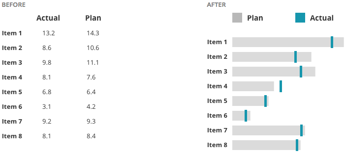
Instead of creating long tables or lists of data, bullet graphs can be a helpful visualisation.
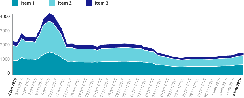
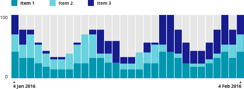
The Line Chart Danger Zone
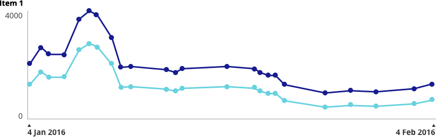
Having worked quite a bit in design around Health, I can tell you: It's probably best to apply a healthy dose of suspicion around line and area charts. The problem is that they often show stages in between two data points which didn't really exist. When in doubt, I default to bar charts because they don't lie. I'll show you what I mean...
Data points across a bar chart are safe. We can see the days that have available data and what the exact input value was on that day.

Now, place these data points on a line chart. As you can see from the red line, we've started to hint at results that aren't real.

Add a Dribbble-worthy layer of smoothing and shading and now we've created even more of a "curve" which didn't really happen.

Of course, how careful you need to be depends on what you're displaying and how high the stakes are. If you can afford to sacrifice a little pin-point accuracy for beauty, then go for it.
Interaction
I'm a big fan of interactive charts where a user can hover over specific data points and view tooltips (do we still call them that?). When designing this, the data line and point should be clearly isolated, like so:
Lines and shading can be used to show alert lines, benchmarks, averages, etc.


I recently had a client who needed to be able to add values to a scatter plot which were un-verified. We came up with this solution of solid vs outlined values:

Similar to hovering over tooltips, I try to make legends interactive when possible. Legend and data are isolated clearly together.

Colour
What good would an article about charting be without some talk about colour?
So, here's the deal: We all know the basics. Green is good, orange & yellow need attention in some way and red is something scary.

Developing a colour palette is a topic that needs its own blog post, but as long as you keep basic colour associations in mind, you're going to be just fine.
When it comes to anything that could be referred to as "colour coding"...
https://twitter.com/ashleymarinep/status/705049544233525249
Do you need to colour code? The answer is "No" more often than not. (I once had a client ask me to colour code all of the individual features in his app. I had to do a set of mockups to show him why looking like a rainbow sneezed across your entire app is a user experience no-no).
One thing that is really important is to make sure that you take into account is accessibility for Colour Blindness. Personally, I use the Spectrum Chrome extension to test out colour combinations.

Below are some simple examples of how colour can be used in charts.
"Feeling" the Weight of Your Data
The final thing I want to talk about is the concept of helping users "feel" their way through the data. Check out The World's Most Boring Data Set. In this use case, high numbers were bad and low numbers are good.

Snooze-fest... but see what happens when we turn those numbers into graphics that use size, weight, colour and opacity:


The eye is automatically drawn to the "good" spots and a user can instantly feel whether this data set is positive or negative.
Fin.
That's all I've got for you today! Have a suggestion, idea, or view to share? Catch me on Twitter @ashleymarinep.

Free Resource Download: Digital Brand & UX Guideline Document
This easy-to-custom template includes pre-formatted sections for a full Digital Brand & UX guideline document.
This easy-to-custom template includes pre-formatted sections for a full Digital Brand & UX guideline document. Sections include:
Primary Logo
Logo Presentation
Brand Colors
Web Fonts
Icons
Dashboard Grid
Navigation
Buttons
Forms
Favicon
Photography
Charts
Social Guidelines
If you found this free resource useful, please follow on Twitter.

guideline-632x3239

9 Gorgeous Children’s Books for Your Mini-Entrepreneur
My five year old nephew can navigate an iPad better than I can! How cool that we get to encourage this new generation to do the things we can’t even dream up yet.
It really blows my mind sometimes when I think about how much the world has changed since I was a kid. I didn’t even know that code was a thing until I was a teenager (oh the good old days of dial up!) but today? My five year old nephew can navigate an iPad better than I can! How cool that we get to encourage this new generation to do the things we can’t even dream up yet. The books below are a gorgeous example of how children’s literature is changing, and moving with the times.


What Do You Do With an Idea?by Kobi Yamada
This is the story of one brilliant idea and the child who helps to bring it into the world. As the child’s confidence grows, so does the idea itself. And then, one day, something amazing happens.
This is a story for anyone, at any age, who s ever had an idea that seemed a little too big, too odd, too difficult. It s a story to inspire you to welcome that idea, to give it some space to grow, and to see what happens next. Because your idea isn t going anywhere. In fact, it’s just getting started. Get it on Amazon


The Most Magnificent Thingby Ashley Spires
Award-winning author and illustrator Ashley Spires has created a charming picture book about an unnamed girl and her very best friend, who happens to be a dog. The girl has a wonderful idea. “She is going to make the most MAGNIFICENT thing! She knows just how it will look. She knows just how it will work. All she has to do is make it, and she makes things all the time. Easy-peasy!” But making her magnificent thing is anything but easy, and the girl tries and fails, repeatedly. Eventually, the girl gets really, really mad. She is so mad, in fact, that she quits.
But after her dog convinces her to take a walk, she comes back to her project with renewed enthusiasm and manages to get it just right. For the early grades’ exploration of character education, this funny book offers a perfect example of the rewards of perseverance and creativity. The girl’s frustration and anger are vividly depicted in the detailed art, and the story offers good options for dealing honestly with these feelings, while at the same time reassuring children that it’s okay to make mistakes.
The clever use of verbs in groups of threes is both fun and functional, offering opportunities for wonderful vocabulary enrichment. The girl doesn’t just “make” her magnificent thing — she “tinkers and hammers and measures,” she “smoothes and wrenches and fiddles,” she “twists and tweaks and fastens.” These precise action words are likely to fire up the imaginations of youngsters eager to create their own inventions and is a great tie-in to learning about Science, Technology, Engineering and Math. Get it on Amazon

The Boy Who Loved Math: The Improbable Life of Paul Erdosby Deborah Heiligman
Most people think of mathematicians as solitary, working away in isolation. And, it’s true, many of them do. But Paul Erdos never followed the usual path. At the age of four, he could ask you when you were born and then calculate the number of seconds you had been alive in his head. But he didn’t learn to butter his own bread until he turned twenty. Instead, he traveled around the world, from one mathematician to the next, collaborating on an astonishing number of publications. With a simple, lyrical text and richly layered illustrations, this is a beautiful introduction to the world of math and a fascinating look at the unique character traits that made “Uncle Paul” a great man. Get it on Amazon


Ish (Creatrilogy) by Peter H. Reynolds
Drawing is what Ramon does. It¹s what makes him happy. But in one split second, all that changes. A single reckless remark by Ramon’s older brother, Leon, turns Ramon’s carefree sketches into joyless struggles. Luckily for Ramon, though, his little sister, Marisol, sees the world differently. She opens his eyes to something a lot more valuable than getting things just “right.” Combining the spareness of fable with the potency of parable, Peter Reynolds shines a bright beam of light on the need to kindle and tend our creative flames with care. Get it on Amazon


Iggy Peck, Architect by Andrea Beaty
Iggy has one passion: building. His parents are proud of his fabulous creations, though they’re sometimes surprised by his materials—who could forget the tower he built of dirty diapers? When his second-grade teacher declares her dislike of architecture, Iggy faces a challenge. He loves building too much to give it up! With Andrea Beaty’s irresistible rhyming text and David Roberts’s puckish illustrations, this book will charm creative kids everywhere, and amuse their sometimes bewildered parents. Get it on Amazon


Rosie Revere, Engineer by Andrea Beaty
Rosie may seem quiet during the day, but at night she’s a brilliant inventor of gizmos and gadgets who dreams of becoming a great engineer. When her great-great-aunt Rose (Rosie the Riveter) comes for a visit and mentions her one unfinished goal–to fly–Rosie sets to work building a contraption to make her aunt’s dream come true. But when her contraption doesn’t fl y but rather hovers for a moment and then crashes, Rosie deems the invention a failure. On the contrary, Aunt Rose inisists that Rosie’s contraption was a raging success. You can only truly fail, she explains, if you quit. Get it on Amazon

The Dotby Peter H. Reynolds
Her teacher smiled. “Just make a mark and see where it takes you.”
Art class is over, but Vashti is sitting glued to her chair in front of a blank piece of paper. The words of her teacher are a gentle invitation to express herself. But Vashti can’t draw – she’s no artist. To prove her point, Vashti jabs at a blank sheet of paper to make an unremarkable and angry mark. “There!” she says.
That one little dot marks the beginning of Vashti’s journey of surprise and self-discovery. That special moment is the core of Peter H. Reynolds’s delicate fable about the creative spirit in all of us. Get it on Amazon
The Web Design for Babies Set by John C Vanden-Heuvel Sr


HTML for Babies
It’s never too early to be standards compliant! Show your little ones HTML markup code along with letter forms to get them started on the visual patterns and symbols that make up the essential building blocks of the Web. The first in a three-volume set, originally designed by a NYC Web Designer for his baby, this beautiful book is a fun and colorful introduction to the world of web design for babies. Get it on Amazon

CSS for Babies
It’s never too early to be standards compliant! Show your little ones how to display HTML elements properly with CSS (Cascading Style Sheets) and familiarize them with the visual patterns and symbols that make up the essential building blocks of the Web. CSS for Babies is the second in a three-volume set, originally designed by a NYC Web Designer for his baby. This beautiful book is a fun and colorful introduction to the ABC’s of the web. Get it on Amazon
Photo Credit Rodrigo Della Fávera

Hi, I’m Ashley. I’m a creator, entrepreneur, gamer, storyteller, and serial doer.