Video Presentation Software Redesign
Platforms: Windows, Mac
Main Roles: User Research, UX Strategy, Software UI Design
Additional Roles: ActionScript Development
Project summary
“VideoScribe is addictive. It’s simple to use, but hugely effective.”
Humans are visual beings, which influences how we consume content. Video presentations have been proven to improve problem-solving by up to 75% and boost subsequent recall of information by 15%. Businesses are looking for a quick means of satisfying that need. VideoScribe helps businesses produce animated whiteboard animations.
I designed a new UX for VideoScribe for Windows and Mac platforms. This helped the development team build a product that satisfied users, and drew the attention of the media.
About Sparkol
Sparkol was founded in 2008 and provides several presentation software products. Their mission is to create engaging ways for people to present and share ideas quickly and easily regardless of budget, design skills or location. Their biggest product, VideoScribe, is currently used by over two million people across 160 countries.
The challenge
To bring the software up to date for the modern user base and boost the overall satisfaction of users.
Despite being already used by millions of individuals, and organizations, VideoScribe had some drawbacks in its UX and needed improvement to meet the current demand and preference of users.
The design process
Understand and discover through research
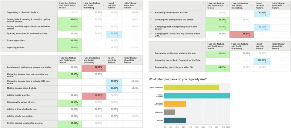
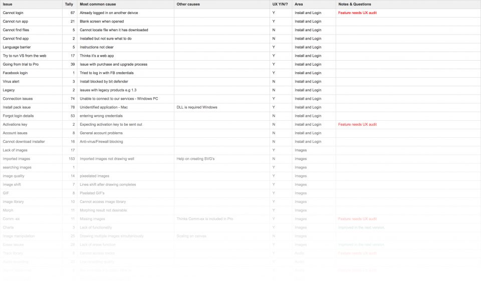
To start, I needed to understand what was already available on the market. Since the product had been in production for nearly eight years, a lot of analytics had already been gathered. I was given full access to support platforms, and a detailed report was drawn up of where users’ difficulties were. We looked at performance, the layout of actions, UX flows, interface design and all other areas of the user experience.
The company had previously compiled a list of loyal customers who were willing to work with us during the process as test users. I wrote a questionnaire which was sent out to assess current impressions of the app features, and gather their hopes for future versions. From the survey and insight from the data I studied, I created a prioritised design and development plan.
Refine flows and UI design
Alongside VideoScribe, the designs I was creating needed to align with two additional greenfield products. To achieve a design language system, I started by taking a detailed outline of the current features and creating a list of where tried-and-true UX patterns that could be applied. I was working on three products simultaneously, Videoscribe and two greenfield projects, so alignment was vital between all products to make sure that I was designing patterns that could be used as a design language for the company as a whole.
At various stages in the project, I held research and testing sessions with internal users, subscribed beta users, and people out of the community who had never used the product before. All feedback was prioritised and combined into future versions of the specification.
As a UX pattern neared completion, I created documents explaining my reasonings for making changes and outlining the research that supported my recommendations.


I had to make sure that the UI was clean enough to work company-wide, and was appropriate for the platform that the user was on (mobile, web or tablet). In the end, we decided on a straightforward UI which was designed to blend into the background of the app, allowing the user’s presentation content to be the star of the show.
I created designs on two levels: guideline templates and individual screen designs. I provided sample HTML/CSS markup for select screens to guide the developers with specific vales and element sizes.
Side-by-side with development

I wrote the development specification, including user stories for use in Jira. I then worked with the development team in Jira and Confluence systems during the build to answer questions and offer general support through launch.
For the webapp within the product, I provided a GitHub repository with full HTML, CSS & jQuery templates which saved a large number of development days and ensured that the app was built to exact UI specifications. At various stages through development, I performed detailed UX & design reviews highlighting areas of risk for a clean interface.
Toward the end of the project, development resource became a concern, so I chose to dive into the code and learn the basics of ActionScript development so I could help ensure that the final product was pixel-perfect. Doing so reduced the weeks to launch and allowed me to work more closely with the team to ensure that we saw eye to eye.
Results, press, and accolades
★★★★☆ Finances Online
★★★★☆ Capterra
★★★★☆ Reviews.co.uk
“VideoScribe is phenomenal. There is not much of a learning curve so you can quickly make professional looking products. I let my subscription lapse, but then realized I could not live without it!”
“My overall experience was beyond excellent. I am a freelancer and this is the only software which is enough for my needs.”
“VideoScribe helps catch my audience’s attention in few seconds and deliver valuable messages and knowledge within minutes. Works like a charm.”
Additional before and after screenshots
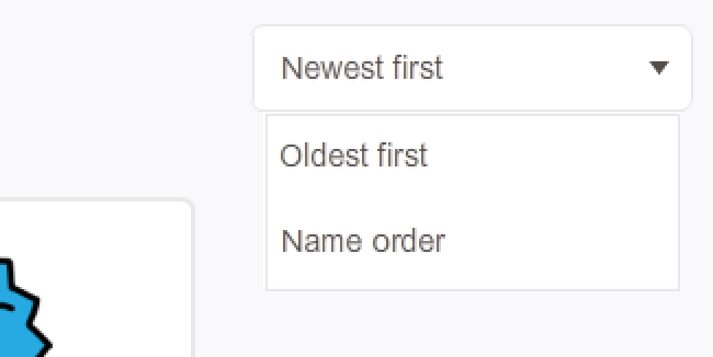
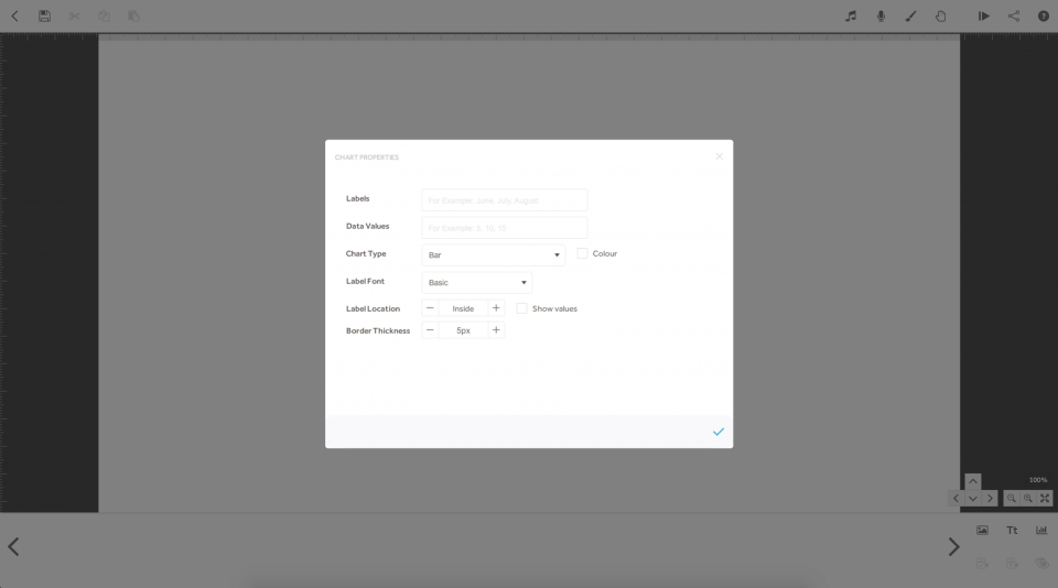
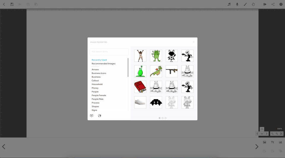
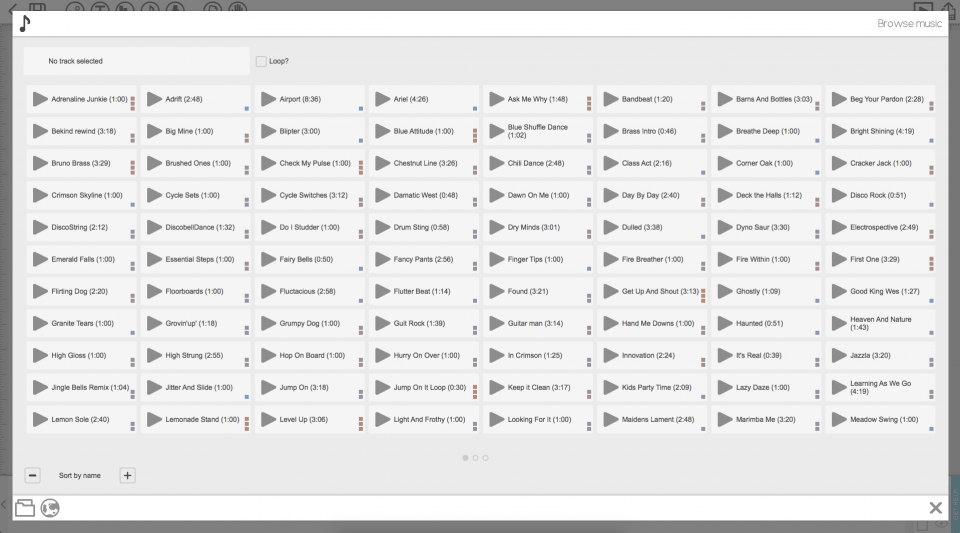
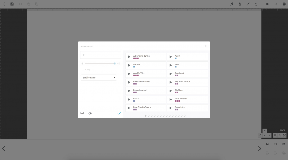
Several areas in the app had UX patterns that were out of the norm. For example, where a dropdown or select menu would generally be, there was a scroller. These were replaced app-wide.

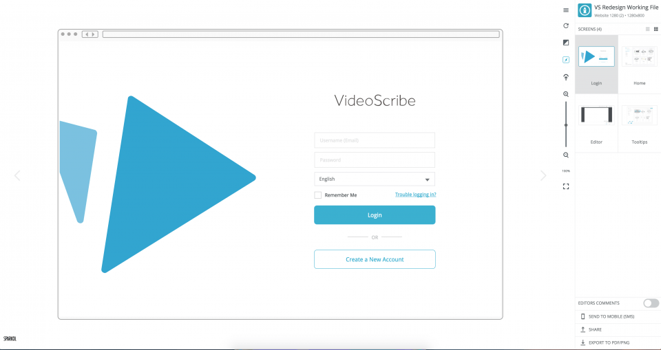
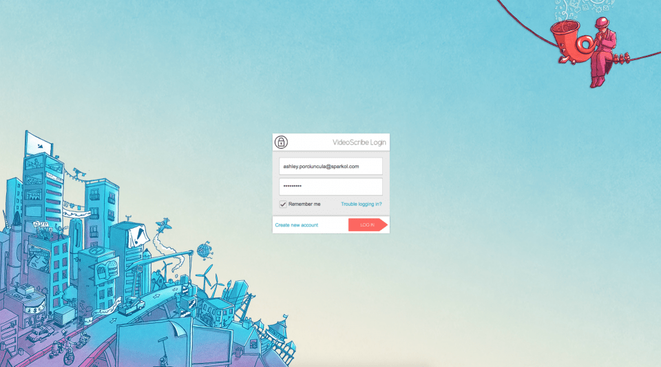
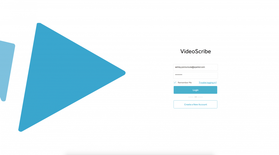
The login screen was very busy, so I redesigned it with an interface that was appropriate for use across all of the company's applications. Branding was brought through with a different primary brand colour and main logo for each.
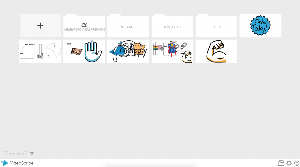
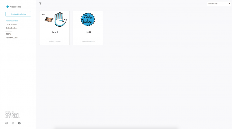
Folders in the main screen were confusing for users, as they did not know the difference between a folder and a project file. I designed a left sidebar navigation to solve for this, so users could clearly see folders, and view more details about their project files.
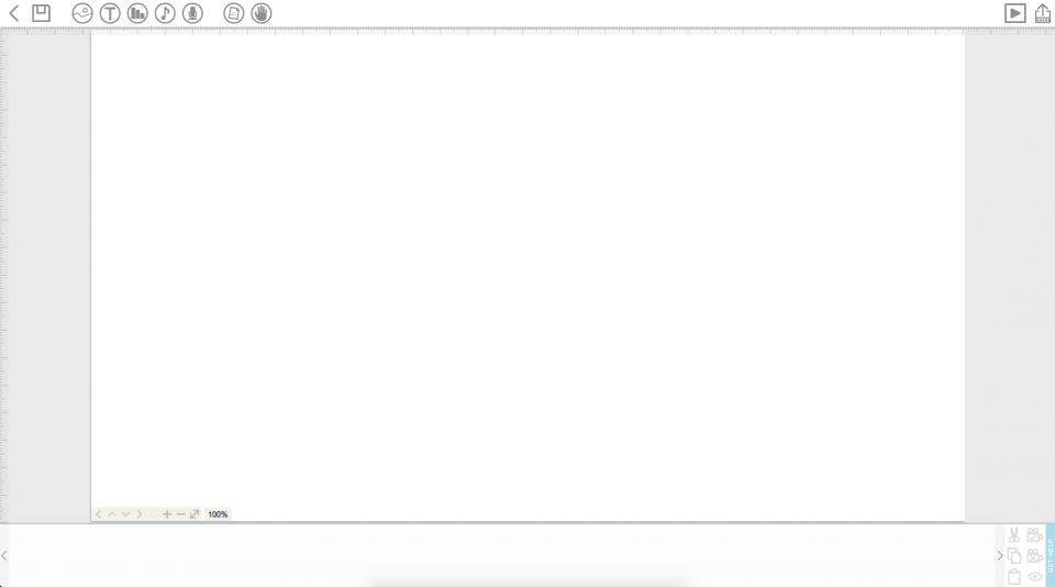
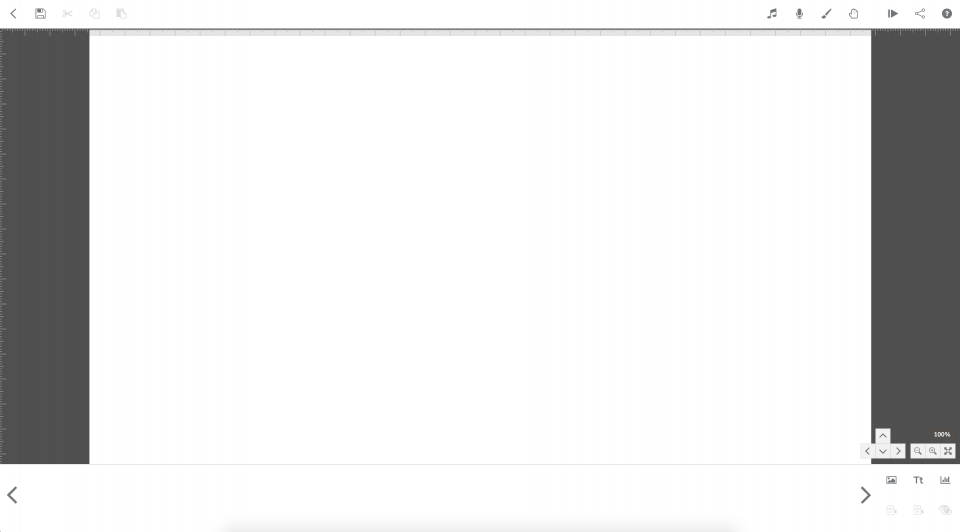
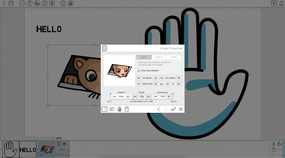
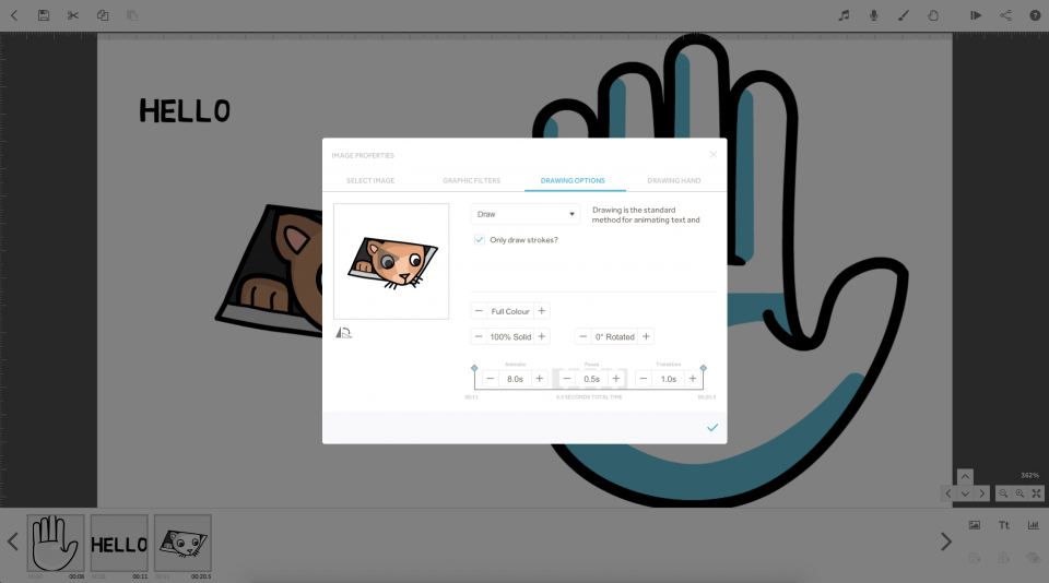
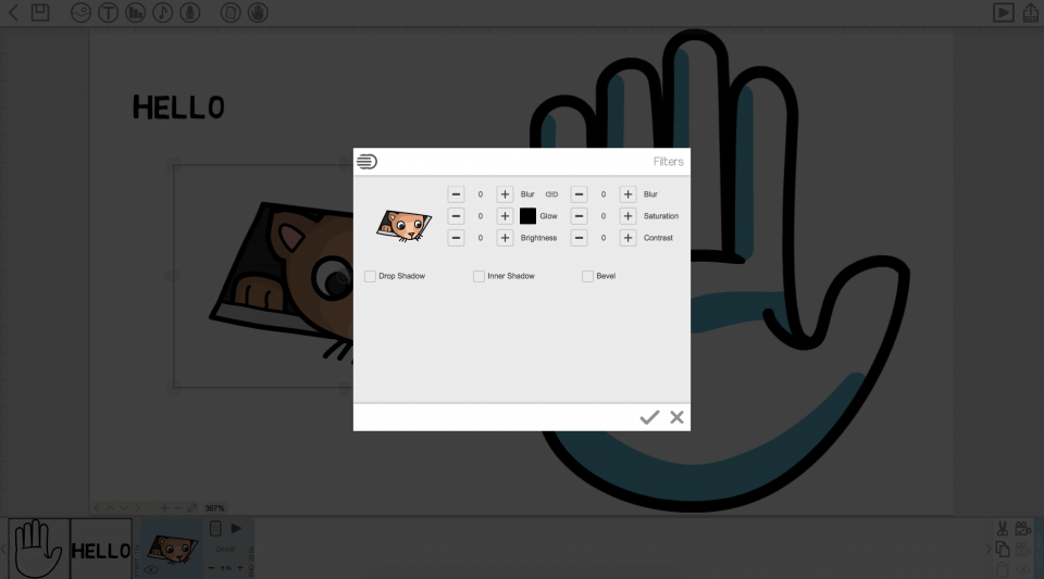
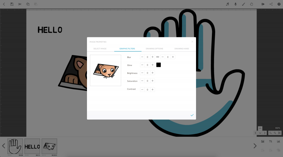
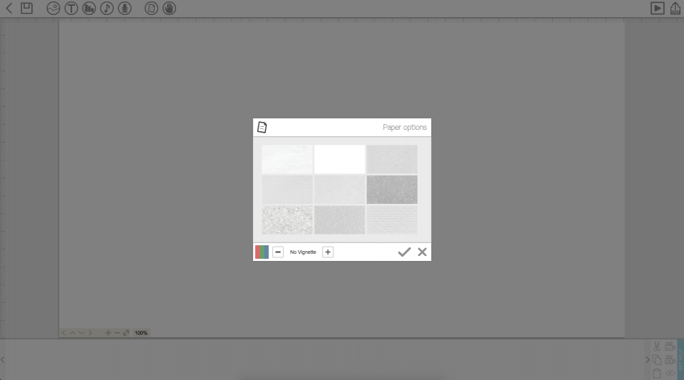
I redesigned the editor for simplicity, with tools and options reorganised in a more standard layout. The artboard colour was also changed to help the user see the boundaries of their presentation.
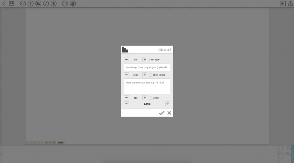
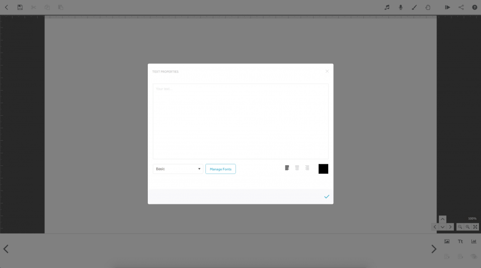
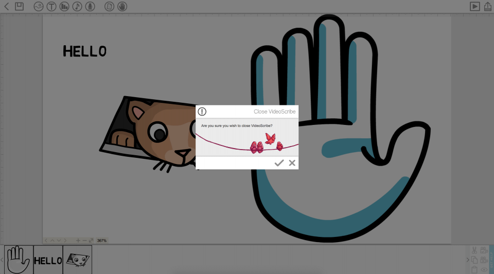
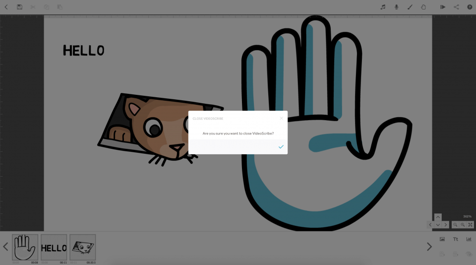
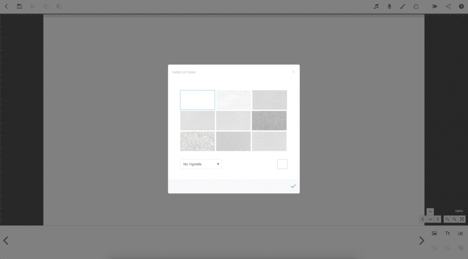
Modals were updated so that the “OK” and “Close” buttons were in more standard places. I also reorganised the standard modal and form layouts.
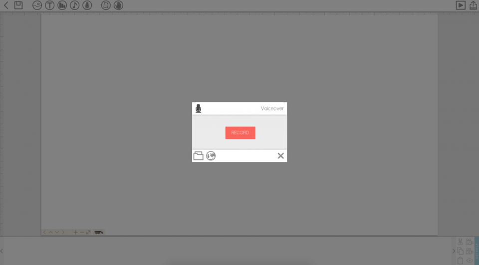
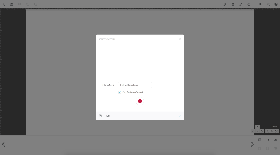
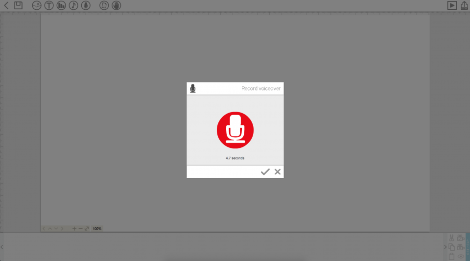
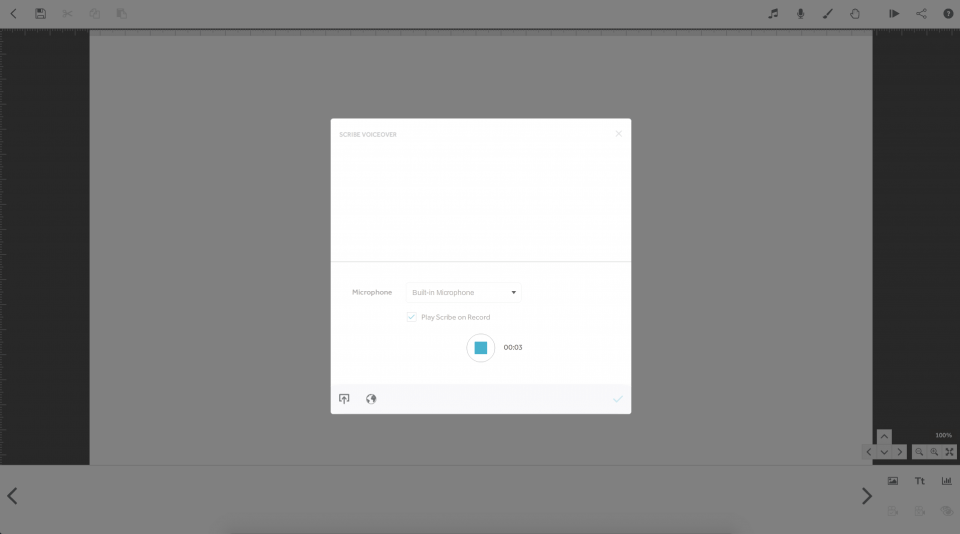
Interactive features and flows like recording audio were redesigned to follow more standard UX principles.